To use Auto Complete, drag and drop it onto the canvas from the toolbox.

Auto Complete tool icon at Toolbox
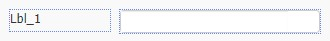
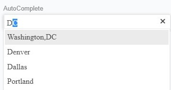
How it looks like on the Canvas
Compatibility
| Free Form | Responsive Form | Mobile |
 |
 |
|
Properties
-
Name: The name of the Auto Complete tool is written here. To edit, go to the Property Panel which is located on the right. This area is saved to the database.
-
Info text: On the client-side, an information text is written about how to enter information into the element. To be information text in the Auto Complete tool, you can write your text in the Info Text area. This text will not be saved anywhere. It will appear visually.
-
Field Style: Select whether the information entered is a constant or SQL query. You can add your data as a Constant Value or SQL Query.
-
Default Value: The value entered here comes into the Auto Complete tool by default. If you want to enter data as the default value, you can write in the Default Value part. It fills the Auto Complete tool area on the client screen.
-
Table Length: Enter the length of the information to be saved in SQL.
-
Text Size: Sets the size of the tool.
-
Minimum Characters: The minimum character value of the information to be written in the tool is entered.
-
Icon: To add an icon to the Auto Complete tool, you can choose from the Icon area. You can change the color and location of the icon.
-
Text Fonts: Type of text; bold, italic, underlined, replacing text; right-aligned, left-aligned, or centered.
-
Color: Edit the color of the text inside and/or inside the tool. To edit the text color and background color of the text, you can change from Color area.
-
Height/Width: It arranges the tool's height and width (The width field has been removed from Responsive Forms).
-
From Left/Top: It arranges the distance of the Auto Complete tool from left and top (This field has been removed from responsive forms).
-
Format: The format of the information to be entered in the Auto Complete tool is selected.
-
Linked Object: A connection is made to an object element created by the action. When the object element runs, information is filled by the object field.
-
Linked Object Area: Select from fields within the linked object field.
-
Values (Text*Value): The values of the tool with the field style fixed value selected are entered.
-
SQL Query: Field style SQL query is written to the selected tool query.
-
Tab Order: Specifies the order of the Auto Complete tool within a form. On the Tab Order, when you skip with <TAB> key the cursor will proceed according to the line.
-
Fit horizontal: Fits the tool to the full screen on the user’s screen.
-
Pin Right: Pin the Auto Complete tool to the right.
-
Display: Makes the Auto Complete tool not appear on the screen.
-
Form Only: It does not save the information entered in the Auto Complete tool to SQL, it only edits it on the form.
Actions
-
On Focus: Assign an “Action” as on focus handler. For more information please click here.
-
On Blur: Assign an “Action” as on blur handler. For more information please click here.
-
When the value changes: Assign an “Action” as on value changes handler. For more information please click here.
-
Keyboard Input: Assign an “Action” as on keyboard input handler. For more information please click here.
-
Validation: Assign an “Action” as on value tool handler. For more information please click here.
-
Calculate: Assign an “Action” as calculate handler for grid tool. For more information please click here.
-
Icon Clicked: Assign an “Action” as click handler for the icon. For more information please click here
Examples Used
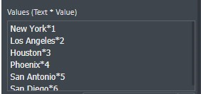
If the Field Style area is Constant Value, you can write in your data to Values(Text*Value) area.
If you write in the values to this area, the values are saved as the same values to the database.
When you start writing on the Auto Complete tool, it completes the text automatically.
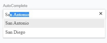
Client view on screen
If the Field Style area in SQL Query, you can write a query from the database in the SQL Query area.
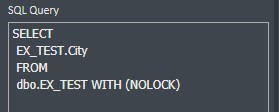
Client view on screen