|
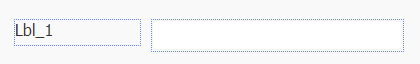
Appearance in Toolbox |
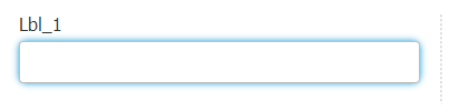
Appearance in Free Form |
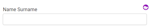
Appearance in Responsive Form |
|
|
 |
 |

Compatibility
| Free Form | Responsive Form | Mobile |
 |
 |
|
Features of the Text Box tool |
|
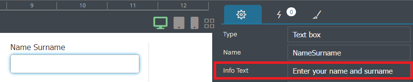
Type : Indicates the field type of the added form tool. The value here cannot be changed. Name : The name of the field that will be created in the database is written. Info Text: On the client side, an informative text can be written on how to enter information into the element.
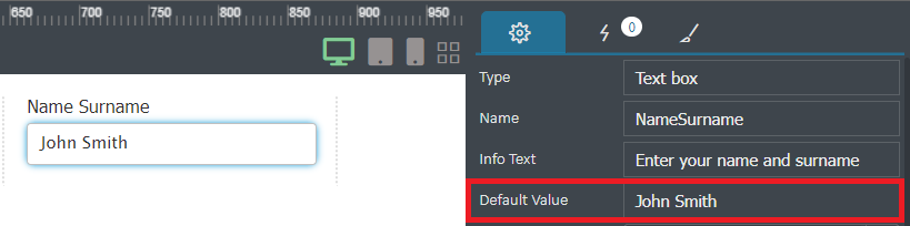
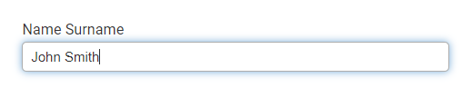
Default Value :The value written in this field is entered into the field on the client screen by default.
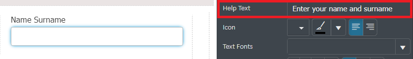
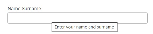
Table Length : The length of the field that will be created in the database is entered. Changes made later in this field do not affect the database. Text Size : The size of the values to be entered in the text box is determined from this field. Help Text : It is the text entered for the explanation to appear when the mouse is hovered over the form tool.
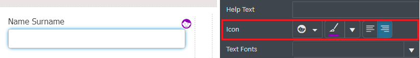
Icon : An icon is assigned to the area to be added, its color and position are selected.
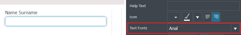
Text Fonts : The font can be changed.
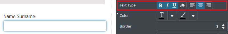
Text Type : The text can be bold, italicized, underlined, right-justified, left-justified, or centered.
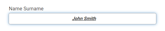
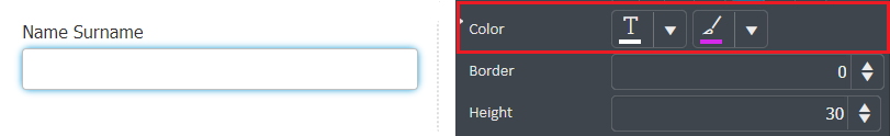
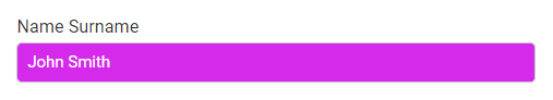
Color : Edits the color of the text inside and/or inside the form tool.
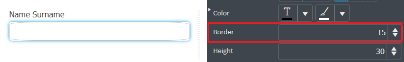
Border : Used to ovalize the frame of the inserted text box.
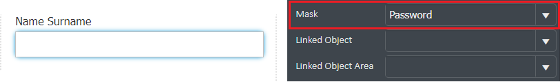
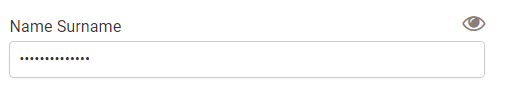
Height : Adjusts the height and width of the form tool (the Width field has been removed from Responsive Forms). Mask : Edit form tool entry for phone, credit cards or password fields.
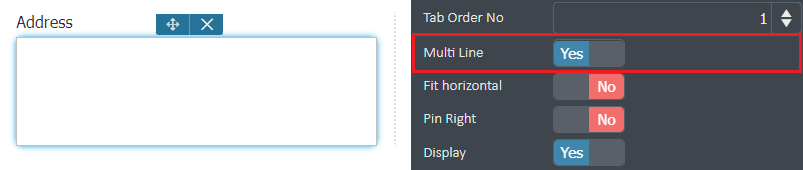
Linked Object : It is provided to bring a value from an object element created with the Create New Data Object action. When the object element runs, information is filled according to the object field. Linked Object Area : Selection is made from the areas inside the linked object area. Click to go to the Create New Data Object actionTab Order No : Specifies the order of the form tool on the tab key. Multi Line : It provides the use of the enter key in the field, that is, the use of multiple lines.
Fit Horizontal : Fits the form tool horizontally to the full screen on the user's screen. Pin Right : Pins the form tool to the right. Display : Makes the form tool not visible on the Client screen. Form Only : It does not save the information entered in the form tool to SQL, it only creates the form. Changes made here later do not affect the database. User Password : Keeps the values written in the text box by encrypting. |

Actions that can be used in the Text Box
There are different actions for each added form element on the form page. To view the actions defined for the Text Box tool, first the text field is selected, then the actions menu on the right panel opens.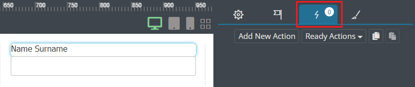
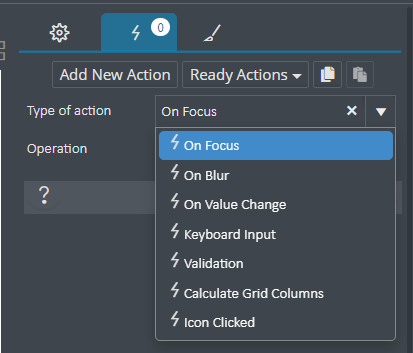
- On Focus : Works when clicking inside the text box area with the mouse or using the enter keys on the keyboard.
- On Blur : It works when another element is passed from inside the text box area.
- On Value Change : Runs when the value inside the text box field changes.
- Keyboard Input : Runs when any operation is done with the keyboard.
- Validation : It is used to control the value when the value inside the text box field changes.
- Calculate Grid Columns : It works when the values inside the grid rows change when the grid element is used on the form page.
- Icon Clicked : If an icon has been added to the text box area, the action will run when this icon is clicked.